
How can we bring kindness, safety, joy and efficiency to a transport operation that moves 7.8 million passengers a day?
– With cartoon!
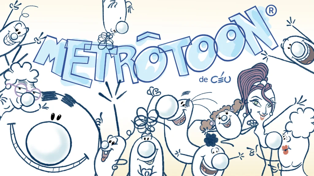
Metrotoon, the subway cartoon
Comments from Céu:
I have always enjoyed working with the ADAG advertising agency. I have collaborated with them on many highly successful projects. The agency is currently led by Celso Piratininga Jr., who upholds the firm’s tradition of connecting with the Brazilian people through a well-balanced blend of understanding the popular mindset and raising the bar for quality—all without arrogance and with a touch of understated sophistication.
When approached for this job, I was given films made in Italy—created with the same objective—as references. The starting point was simple: short animations showing the wrong way to do things, designed to make people laugh while raising awareness about the right way.
The design process moved quickly at
first. I used stylized shapes similar to those I employed when sketching out the initial layouts for my own projects. I decided to create a set of 10 base characters that could be multiplied into hundreds of variations simply by changing a few details, such as hairstyles, nose shapes, or accessories.
The process of creating the initial pilot films took place alongside the design development of wayfinding elements for train and station interiors—such as posters, pictograms, floor and wall signage. That is when I realized the best approach was to base the art direction on the established color-coding system tailored to passenger needs: GREEN for cyclists, BLUE for people with special needs, and PUMPKIN for everyone else. And when all three groups are present together, the scheme shifts to WHITE with subtle pastel tones.
I chose to use a charcoal style and draw everything by hand. The goal was to humanize the artwork as much as possible—no computer graphics or digital effects. AI animation wasn’t available yet, but had it been, I certainly would have rejected it. After all, to bring kindness and human warmth into the cold, industrial communication environment of the Metro, it was crucial to make it clear that our artwork was created by human beings.
This shaped everything that followed, including the design and communication guidelines themselves. It also made us realize that serious strategic errors had accumulated in the Metro’s most basic signage. For instance, on one line, passengers were instructed to enter the cars through the center of the doors and exit via the sides, while on another line, the instructions were exactly the OPPOSITE! I will refrain from commenting on how such a glaring error made its way into the system or the chaotic effects it caused.
But before we could begin implementing our system, we had to standardize and organize practices like these.
The short films were produced and released gradually. Some scripts came together easily because the issues were so obvious. Others were more challenging, requiring us to find the right tone for the information and figure out how to engage the audience. Yet, these turned out to be the best films—such as the ones about watching your bag or holding children’s hands, which happen to be my personal favorites.
I created, directed, and animated almost all of them. Animator Vagner Farias worked on a few films, while Michael Santos, Emerson Pereira, and Eduardo Ramuski assisted with coloring and post-production.
The film scores were composed by Maestro Milton Miné and produced by Lógico Music.
I also produced dozens of illustrations featuring stylized characters; these were used for giant cut-out displays placed throughout the stations. Passengers would interact with them by taking selfies, thereby inadvertently boosting the campaign.
An outdoor projection-mapping film shown during the 2019-2020 holiday season on one of the Metro’s central buildings—located near a city cultural center—marked the launch of the campaign. In this film, among other elements, an animated character interacted with a live rock band performing on stage.
The rollout of the campaign and the communication system began in 2020 and continued through 2023. However, as is unfortunately common in Brazil, despite its enormous success—the metrics of which are detailed below—the initiative was discontinued for political reasons. The São Paulo Metro—particularly the Blue, Red, and Green lines—is partially managed by the São Paulo State Government. Consequently, the priorities of the communication strategy shift whenever the officials in charge change, particularly the heads of the Transport and Communication departments.
The campaign ran exclusively through Metro’s own channels. It comprised 84 social media posts generating 260,000 organic impressions, over 1.5 billion displays on in-train monitors, and 23 million displays on digital panels within stations. Beyond the screens, the characters appeared on 500,000 system maps and thousands of stickers placed on platforms, elevators, escalators, fare gates, and other transit points.
The impact was measured: a post-launch survey revealed that 62% of passengers noticed the new characters, and 96% rated the initiative positively—an unprecedented result for a Metro educational behavioral campaign, according to the project report. The work won a silver medal in the Design category at the Colunistas Awards and received Special Recognition in the Marketing Campaigns category at the 2023 UITP Awards, presented in Barcelona by the International Association of Public Transport.
The most significant aspect was the remarkable impact on passenger behavior. Having lived in Paris, London, and New York City, I have points of comparison with other subway systems. While the São Paulo metro is one of the cleanest in the world, it had always left something to be desired regarding the chaotic and even abrasive behavior of its passengers. The campaign clearly changed that, and I witnessed the shift firsthand. However, for social behavior to truly stabilize, especially after decades of bad habits, it takes more than the three years the campaign lasted. I am writing this in 2026; the campaign ended three years ago and was never replaced by anything of comparable quality or reach. I have even documented the regression through photos and videos. Sadly.
I hope a new campaign is presented as soon as possible, whether or not it involves my collaboration. The daily transport of students and workers is a crucial factor for a better quality of life, and no public official should neglect it.